Rule of Thirds – perhaps the most important foundational composition principle, it is one of the basics for well-balanced photos. So here is some fun to chew on…

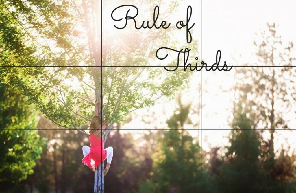
Imagine breaking down a photo into equal thirds, both horizontally and vertically, drawing invisible lines up and down and across the photo, to create a “grid” of nine equal squares.
This gives you 4 points (where each of the lines intersect) and 4 lines, whereas to place important points of interest in your photo.

The theory is that when you place the subject, or an interesting part of your photo along one of these lines or at the intersection points, it establishes balance in the photo, and creates a more natural scene to allow the viewer to more easily interact with it.

Studies have shown that the human eye is naturally drawn to these points in a photo, and by strategically composing your photo with these landmarks in mind, it helps give your photo an artistic advantage.
However, this is not to say that you should always compose photos this way, as there are many “centered” compositions that are very striking, however, knowing and understanding a “rule” will help you to intentionally and effectively break it under the right circumstances.
Here are some other pointers to keep in mind when considering the “rule of thirds”:
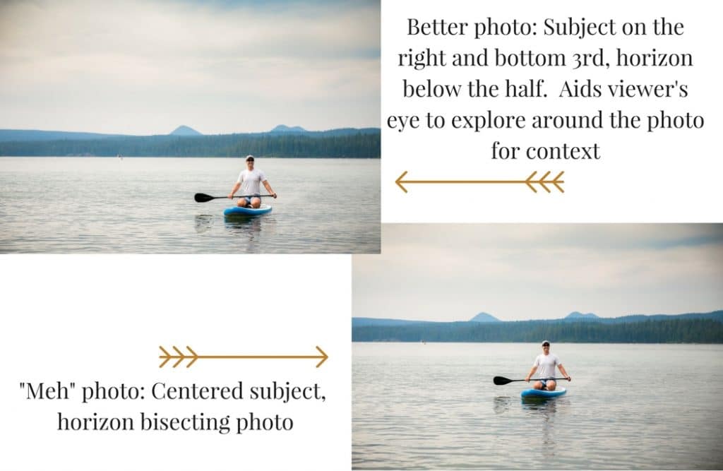
- Avoid “bisecting” a photo with a horizon or other strong line. Horizon lines should usually fall along the bottom third, or the top third of the photo. Example:

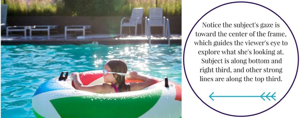
2. When placing a profile of a person along one of the side lines, position them so that they are looking into center of the photo rather than toward the outer edge of the frame. It gives the viewer a sense of mystery and the subject’s eye will guide the viewer’s eye to look around the frame.

When you are practicing this technique, ask yourself the question, “what is the main point of the photo?” and “where should the viewer look first?” This will help you as you’re composing your frame and when you are cropping it in post-processing.
*Source: Digital Photography School